5 Example Charts with ggplot2
Inspired by this blog post by Albert Rapp.
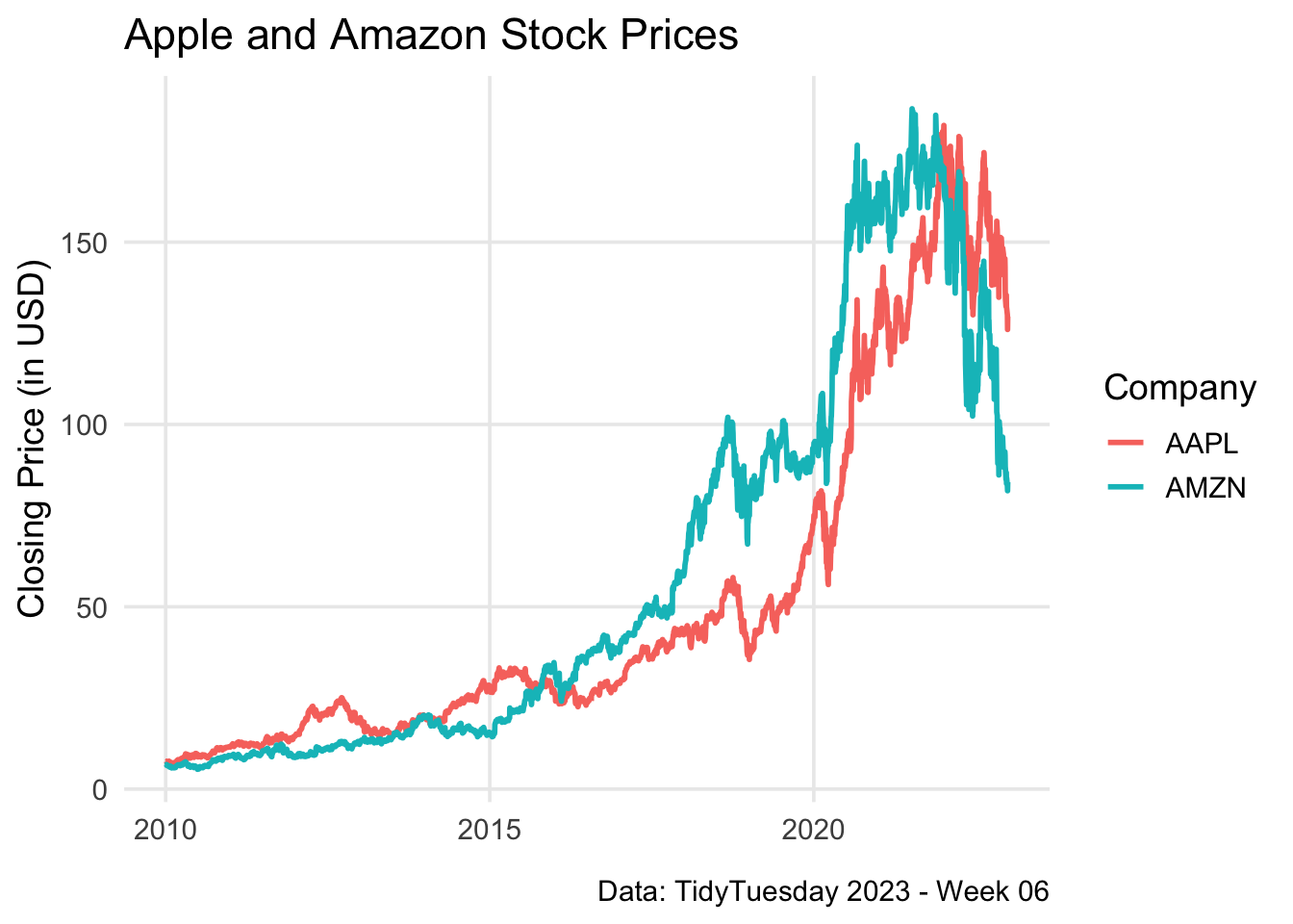
Line Chart
library(ggplot2)

aapl_amzn_stock_prices <- readr::read_csv('https://mlorenzen.com/a_csvfile/aapl_amzn_stock_prices.csv')

aapl_amzn_stock_prices |>
  ggplot(aes(x = date, y = close, color = stock_symbol)) +
  geom_line(linewidth = 1) +
  labs(
    title = "Apple and Amazon Stock Prices",
    caption = 'Data: TidyTuesday 2023 - Week 06',
    x = element_blank(),
    y = "Closing Price (in USD)",
    color = 'Company'
  ) +
  theme_minimal(base_size = 14, base_family = "") +
  theme(
    panel.grid.minor = element_blank()
  )
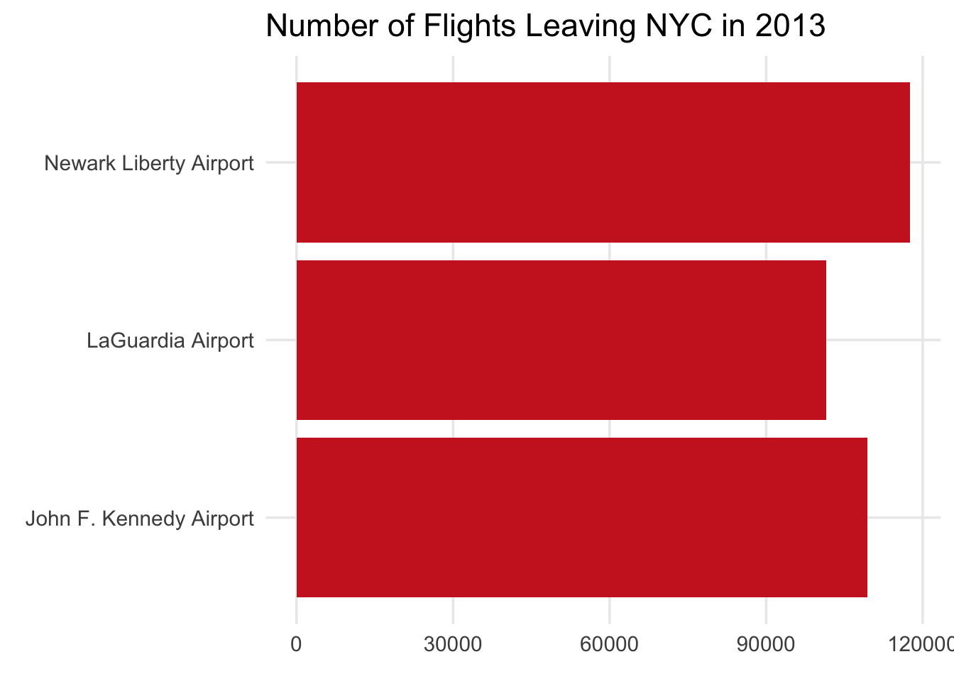
Bar Chart
library(ggplot2)
library(dplyr)

flights_count <- nycflights13::flights |>
  filter(!is.na(dep_time)) |>
  count(origin) |>
  mutate(origin = case_when(
    origin == "EWR" ~ "Newark Liberty Airport",
    origin == "JFK" ~ "John F. Kennedy Airport",
    origin == "LGA" ~ "LaGuardia Airport"
  ))

flights_count |>
  ggplot(aes(y = origin, x = n)) +
  geom_col(fill = 'firebrick3') +
  theme_minimal(base_size = 14, base_family = "") +
  theme(
    panel.grid.minor = element_blank()
  ) +
  labs(
    x = element_blank(),
    y = element_blank(),
    title = "Number of Flights Leaving NYC in 2013"
  )
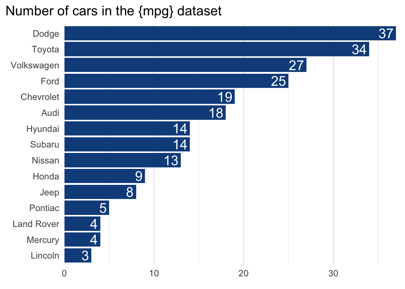
manufacturers <- mpg |>
  dplyr::mutate(manufacturer = stringr::str_to_title(manufacturer))
library(ggplot2)
library(dplyr)
library(forcats)

manufacturers |>
  mutate(
    manufacturer = forcats::fct_infreq(manufacturer) |>
      forcats::fct_rev()
  ) |>
  ggplot(aes(y = manufacturer)) +
  geom_bar(fill = 'dodgerblue4') +
  geom_text(
    data = count(manufacturers, manufacturer),
    mapping = aes(
      x = n, y = manufacturer, label = n
    ),
    hjust = 1,
    nudge_x = -0.25,
    color = 'white',
    size = 6
  ) +
  labs(
    x = element_blank(),
    y = element_blank(),
    title = 'Number of cars in the {mpg} dataset'
  ) +
  theme_minimal(
    base_size =14,
    base_family = ''
  ) +
  theme(
    panel.grid.major.y = element_blank(),
    panel.grid.minor.y = element_blank(),
    plot.title = element_text(
#      family = 'Merriweather',
      size = rel(1.2)
    ),
    plot.title.position = 'plot'
  ) +
  scale_x_continuous(
    expand = expansion(mult = c(0, 0.01))
  )
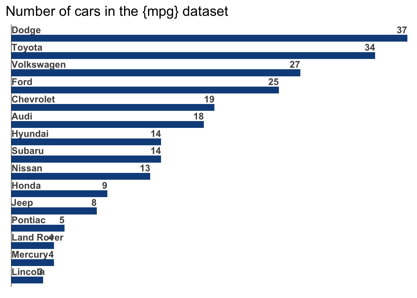
library(ggplot2)
library(dplyr)
library(forcats)
library(stringr)

manufacturers |>
  mutate(
    manufacturer = forcats::fct_infreq(manufacturer) |>
      forcats::fct_rev()
  ) |>
  ggplot(aes(y = manufacturer)) +
  geom_bar(
    just = 1,
    fill = 'dodgerblue4',
    width = 0.4
  ) +
  geom_text(
    data = count(manufacturers, manufacturer),
    mapping = aes(
      x = n,
      y = manufacturer,
      label = n
    ),
    hjust = 1,
    vjust = 0,
    nudge_y = 0.1,
    color = 'grey30',
    fontface = 'bold',
    size = 4
  ) +
  geom_text(
    data = count(manufacturers, manufacturer),
    mapping = aes(
      x = 0,
      y = manufacturer,
      label = stringr::str_to_title(manufacturer)
    ),
    hjust = 0,
    vjust = 0,
    nudge_y = 0.1,
    nudge_x = 0.05,
    color = 'grey30',
    fontface = 'bold',
    size = 4
  ) +
  labs(
    y = element_blank(),
    x = element_blank(),
    title = 'Number of cars in the {mpg} dataset'
  ) +
  theme_minimal(
    base_size = 14,
    base_family = ''
  ) +
  theme(
    panel.grid = element_blank(),
    plot.title = element_text(
#      family = 'Merriweather',
      size = rel(1.2)
    ),
    plot.title.position = 'plot'
  ) +
  geom_vline(xintercept = 0) +
  scale_x_continuous(
    breaks = NULL,
    expand = expansion(mult = c(0, 0.01))
  ) +
  scale_y_discrete(breaks = NULL)
Histogram
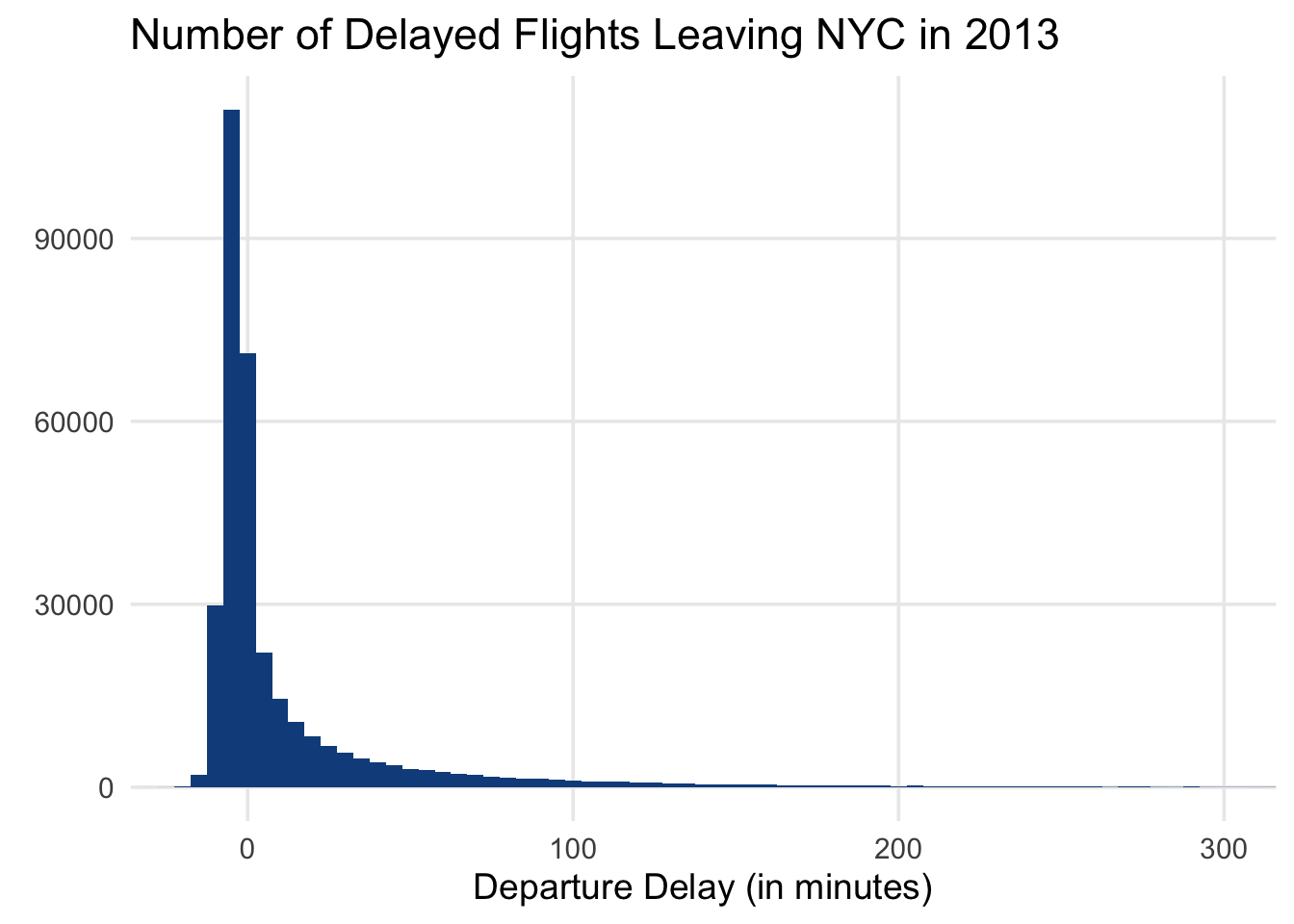
library(ggplot2)
library(dplyr)

departed_flights <- nycflights13::flights |>
  filter(!is.na(dep_delay))

departed_flights|>
  ggplot(aes(x = dep_delay)) +
  geom_histogram(fill = 'dodgerblue4', binwidth = 5) +
  coord_cartesian(xlim = c(-20, 300))  +
  theme_minimal(base_size = 14, base_family = "") +
  theme(
    panel.grid.minor = element_blank()
  ) +
  labs(
    x = 'Departure Delay (in minutes)',
    y = element_blank(),
    title = "Number of Delayed Flights Leaving NYC in 2013"
  )
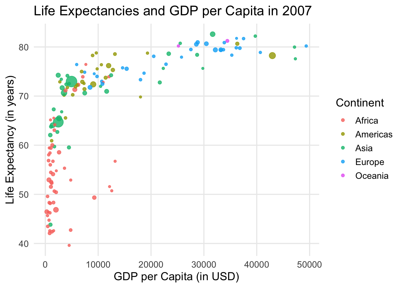
Scatterplot + Bubble Chart
library(ggplot2)
library(dplyr)

gapminder::gapminder |>
  filter(year == 2007) |>
  ggplot(aes(x = gdpPercap, y = lifeExp)) +
  geom_point(
    aes(color = continent, size = pop),
    alpha = 0.8
  ) +
  theme_minimal(base_size = 14, base_family = "") +
  theme(
    panel.grid.minor = element_blank()
  ) +
  labs(
    x = 'GDP per Capita (in USD)',
    y = 'Life Expectancy (in years)',
    title = "Life Expectancies and GDP per Capita in 2007",
    color = 'Continent',
    size = 'Population'
  ) +
  guides(size = guide_none())
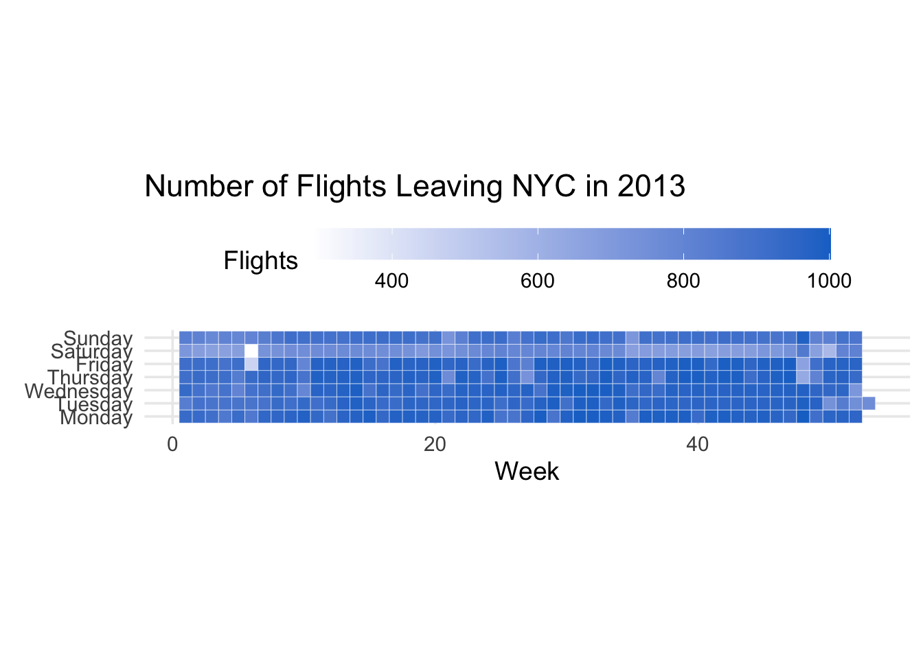
Heatmap
library(ggplot2)
library(dplyr)
library(lubridate)

flights_day_counts <- departed_flights |>
  mutate(
    date = lubridate::make_date(year, month, day),
    week = lubridate::week(date),
    day = lubridate::wday(date, week_start = 1)
  ) |>
  count(week, day) |>
  mutate(
    day = case_when(
      day == 1 ~ "Monday",
      day == 2 ~ "Tuesday",
      day == 3 ~ "Wednesday",
      day == 4 ~ "Thursday",
      day == 5 ~ "Friday",
      day == 6 ~ "Saturday",
      day == 7 ~ "Sunday"
    ),
    day = factor(day, levels = c(
        "Monday",
        "Tuesday",
        "Wednesday",
        "Thursday",
        "Friday",
        "Saturday",
        "Sunday"
      )
    )
  )


flights_day_counts |>
  ggplot(aes(x = week, y = day, fill = n)) +
  geom_tile(color = 'white') +
  coord_equal() +
  scale_fill_gradient(low = 'white', high = 'dodgerblue3') +
  theme_minimal(base_size = 14, base_family = "") +
  theme(
    panel.grid.minor = element_blank(),
    legend.position = 'top'
  ) +
  labs(
    x = 'Week',
    y = element_blank(),
    title = "Number of Flights Leaving NYC in 2013",
    fill = 'Flights'
  ) +
  guides(
    fill = guide_colorbar(barwidth = unit(10, 'cm'))
  )